If you’re working on a video project in Adobe Premiere Pro and want to change the font style of your text, it’s easy to do even for absolute newbies. Changing the font in Premiere Pro can greatly enhance the visual appeal of your project. In this guide, I’ll walk you through the process of changing the font in Premiere Pro, as well as some tips and tricks for working with text in the program.
How to Change Font in Premiere Pro
Changing any text font in Premiere Pro is very straightforward. Just use these 4 steps to change a text font.
Step 1:
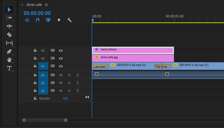
First write your text, by selecting the type tool [ T ]. If you already write a text then, Select your text layer and then go to the Effects Control panel. To find Essential Graphics go to Windows then Essential Graphics.
Step 2:
In the Effect Control, you will find all the settings and also you can change the color, size, background, stroke, etc.
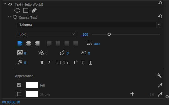
Now under the Source Text, you will see the default Adobe premiere pro font was selected. Now click the default font and select your font.
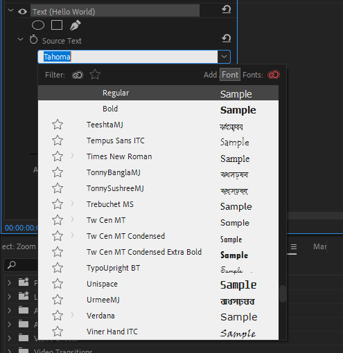
Once you selected a new font from the drop-down menu, you should see the changes right away in your video.
How To Change Font Using Motion Graphics Template in Premiere Pro
Motion graphic template (MOGRT) are files that are commonly saved in Premiere Pro. If you choose a MOGRT, you might realize that it isn’t appropriate for your project and you will need to change it.
To change the MOGRT, choose the MOGRT file from your timeline in the important graphics panel. Next, go to the edit tab in the panel’s primary graphics. Fonts, color, size, and other factors can all be changed in the edit tab.
How to Replace The Font of Multiple Texts at Once Using Premiere Pro
You may be working on a project and realize that you need to use the same font throughout many visual text documents that have been opened in succession. Updating each paragraph separately will take too much time.
The font can be changed quickly by selecting Replace Fonts in Projects from the Graphics Menu. The replace font choice will be shown to you after a function panel appears.
After the replace font choice appears, you will have to choose the font of your choice to replace all other fonts used in the project. Keep in mind that only fonts produced by the graphic panel are affected by this.
Check out our in-depth guide on adding text in Premiere Pro.
How Does Choosing The Right Font Impact a Project?
Using a good font is very important when you are designing any project. This is because using a professional font promotes credibility and authority. A professional font can also make your project look more polished and well put.
One good method to guarantee that your project leaves a positive impression on its audience is to use a professional font. Did you also know that professional fonts can give your work a touch of class and sophistication? So, when you are thinking of all the awesome things you are going to have on your edited work, also think of the font that you want to use. Other awesome things you can definitely add to your work is transition effects and audio keyframes. I definitely use those two a lot. Probably way more than I should! Hehe.
The right font can also assist you in passing your message to your audience more effectively. A good font is excellent when you utilize decent language. This is because it can make your work easier to read and more aesthetically pleasing. Finally, using a premium font can help you stand out from the competition and add special touches to your work!
Factors to Consider When Choosing a Font
So, you want to change your font and you are wondering what the best one to use is? Go through the guideline below.
- Mood
There is a mood for every project. Whatever the mood—formal or casual, lighthearted or somber, there is a font for your every mood. Each font has a mood, just like every project also has a mood.
You need to think about the project’s tone and how the fonts you are considering will either support or contradict it. Think about this; A website for a law office wouldn’t look good if Comic Sans was used. The website for the law office would be much better if a font like Crimson Text or Helvetica was used.
- Function
In my opinion, functionality should be considered above all else when choosing a font. You see, every font does not look good in every size and weight. Your fonts might lose their legibility at lower sizes even while they look fantastic at larger sizes.
However, some fonts appear fine in almost any size. To ensure that a font is readable at every size, designers should test it before use.
We also recommend that you see our step-by-step guide on how to fade out music in Premiere Pro.
Leave a Reply
You must be logged in to post a comment.